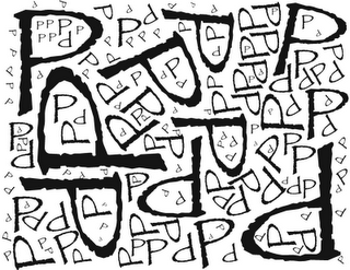
Single Letterfom :
- Relative proportions of all letterforms must be the same (use the letterform as a single shape)
- Use a minimum of 5 letters - there is no maximum
- Design must be BLACK and WHITE (no gray)
- Design must be 8.5 x 11
 |
| Typography and Composition Ex.2 Figure Ground Page War I: |
||||||
| Create a design in black and white, using multiple letterforms, in which it is impossible to distinguish the foreground from the background. | ||||||
|
||||||
|
||||||
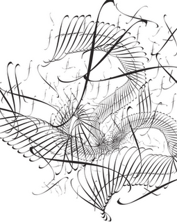
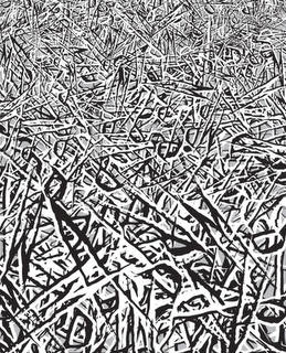
| Typography and Composition Ex.3 Texture and Depth |
Typography and Composition Ex.4 Texture and Depth |
||
 |
 |
||
|
|
||
| Typography and Composition Ex.5-7 The WORD is (ok the words are) abstract expressionism |
||
| Choose three words from the list below: | ||
| disoriented, dieting, inbred, tears, robotics, able, skillful, absolute, unqualified, antagonistic, uniform, affable, diffident, humble, dissonant, opulent, abundant, ample, artificial, hectic, mindless, accumulate, independent, magnanimous, authoritative, miserly, cautious, petulant, charm, firm, harmonious, esoteric, calm, crude, copious, jagged, expensive, hierarchical, pernicious, furious, furry, barren, corpulent, varied, atonal, vapid, viscous | ||
| 3 designs, each capturing the essence of the word. | ||
| Each design will start with a different value background, 1 black, 1 white, 1 gray. | ||
| Consider the relationship of the type to the entire composition as it relates to the meaning of the word. | ||
| In each design, repeat the word a minmum of five times. |
Project 1: |
Movie Poster Made Completely of Type |
||||
| Step 1: | Research (post to Design History Blog) | ||||
| Must be posted by Monday, Sept. 14 | A. | Find Examples of FOUR Movie Posters: | |||
|
|||||
| B. | For each poster list the designer (if you can find her/him/team) and date created (movie release date is OK) | ||||
| C. | For each poster describe the composition in two sentences. Use at least one of the following terms in your description: | ||||
| Emphasis, Rhythm, Balance, Unity, Motion, Weight, Contrast, Texture, Depth, Tension, Direction | |||||
| Step 2: | Design (post to Design Projects Blog) | ||||
| Must be posted by Monday, Sept. 21 | Create a black and white poster design for a movie that already exists, made completely of type. Remember the exercises we have done in class so far, especially the texture exercises. Evoke either the mood or genre of the film with your design. | ||||
| RULES: | |||||
| 1. | Tabloid Size Design | ||||
| 2. | Single Typeface | ||||
| 3. | A Redesign for any Pre-existing Movie | ||||
| 4. | Black and White Only (gray must come from variation in point size) | ||||
| 5. | All Visible Shapes Must Be Made of Type | ||||
| EXAMPLES: | Keep in mind that the assignment for the examples below was a little different than yours, you still need to read and follow the rules above | ||||
| Ahsha Bell | 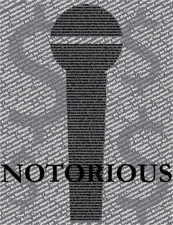 |
||||
| Brian Bass | 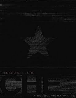 |
||||
| Rezvan Farahany | 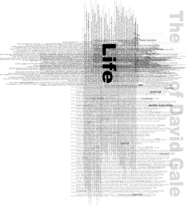 |
||||
| Chris Hayward | 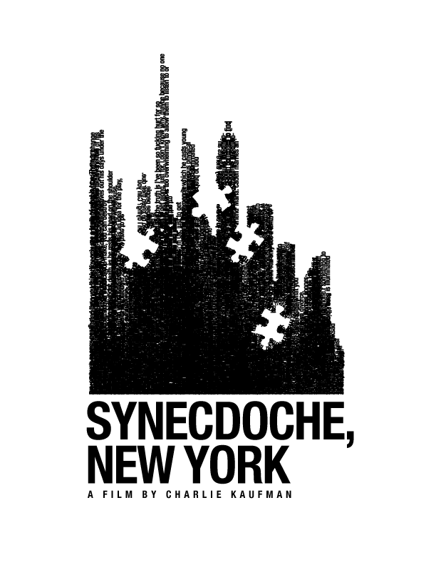 |
||||
| Keith Kennedy | 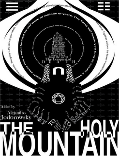 |
||||
| Robin Kingsbury | 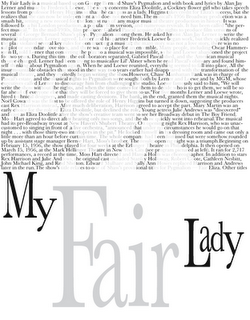 |
||||
| Melani Metcalf | 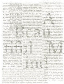 |
||||
| Pavel Protsyuk | 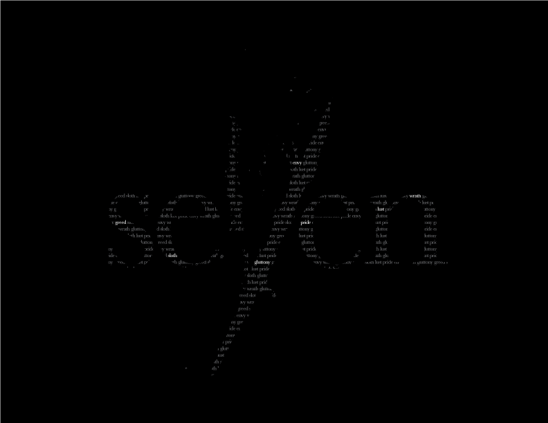 |
||||